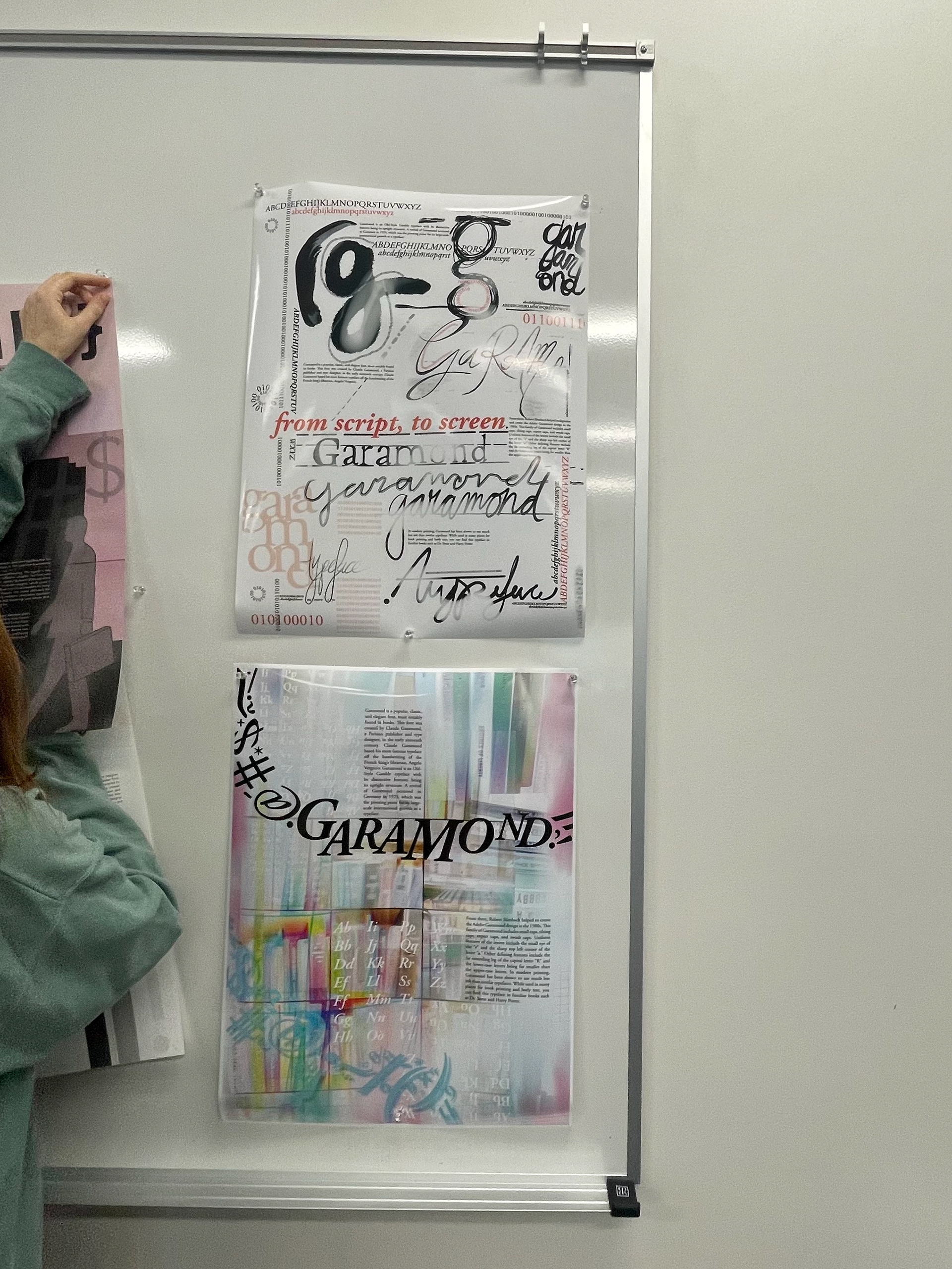
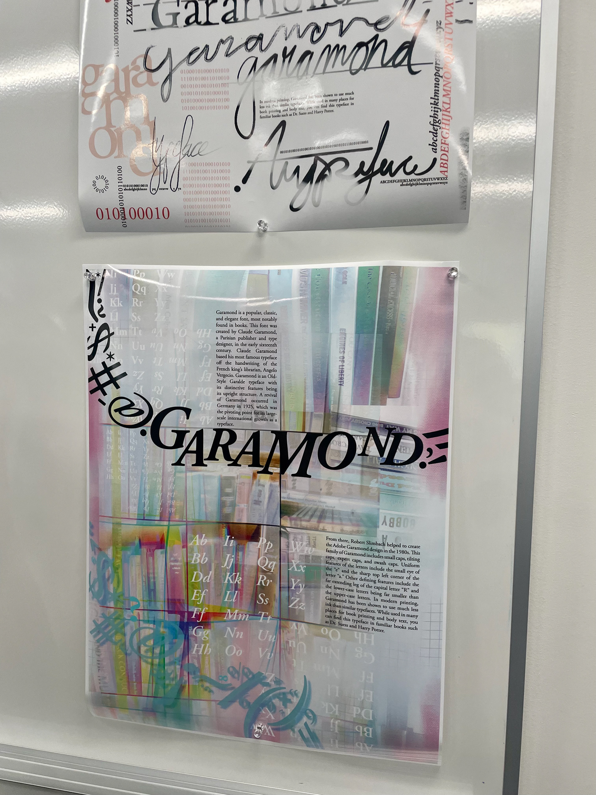
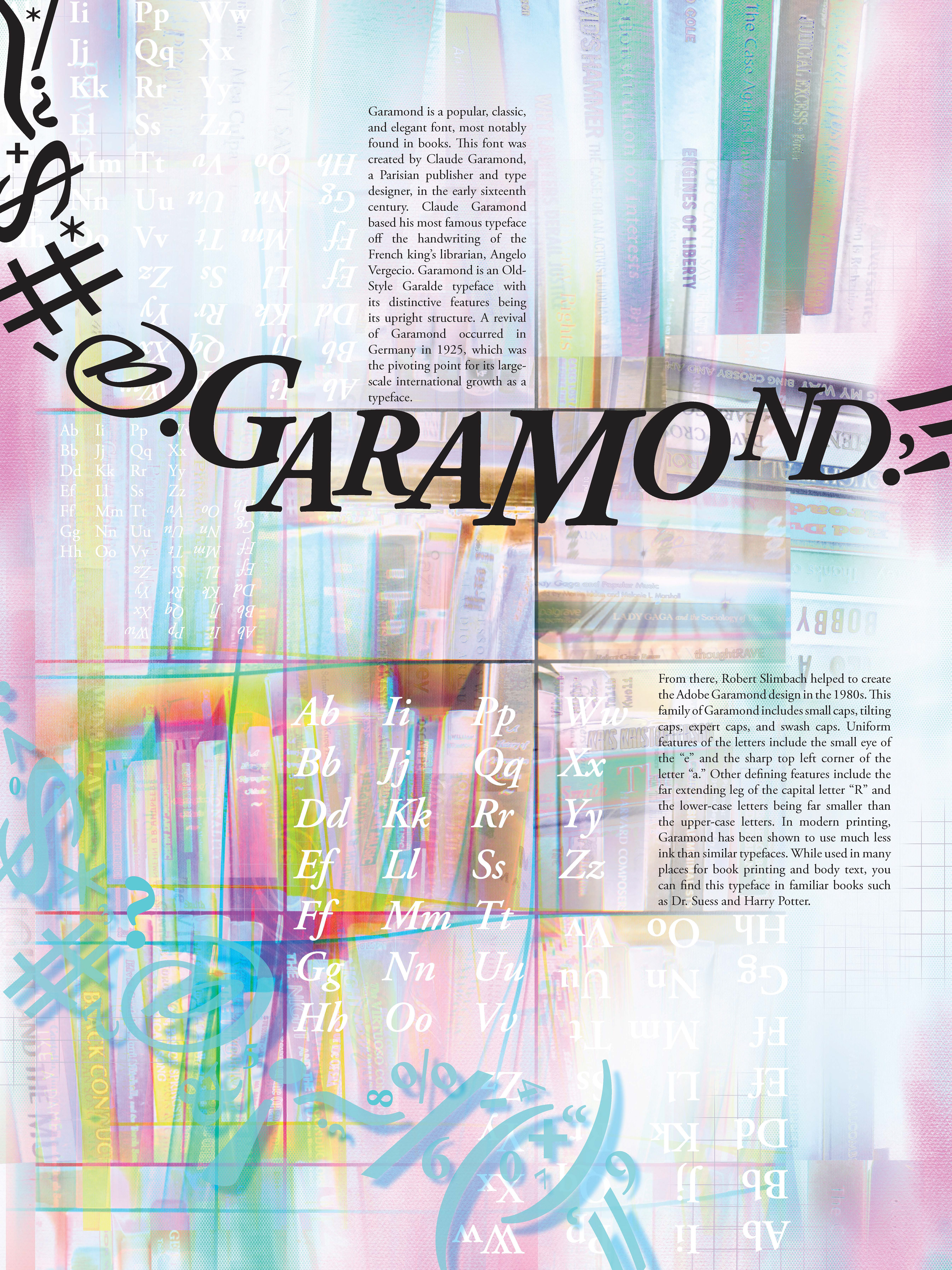
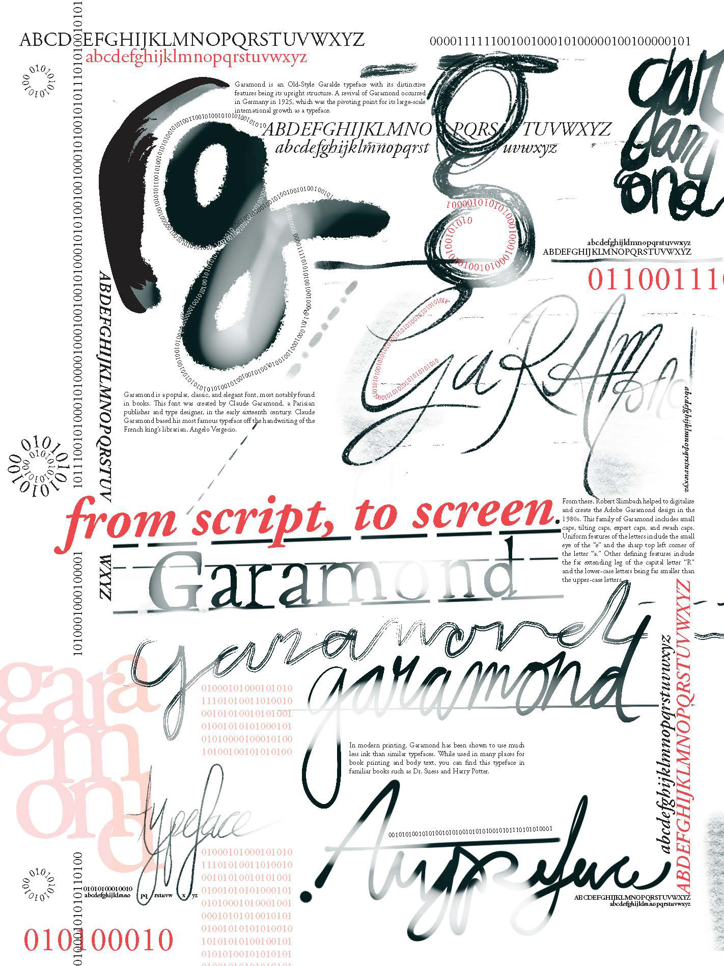
Two posters, taking a twist on the typical type foundry specimen sheet. Each poster includes upper and lower case, special characters, numbers of the font, and a brief paragraph that covers the history and fun facts of the font.
About Garamond: It's a popular and elegant font, found in many books. This font was created by Claude Garamond, who based this font on the handwriting of the French king's librarian, Angelo Vergecio. In the 80s, it was then created into Adobe Garamond. Key features include the small eye of the "e," the sharp top left corner of the "a," and the far extending leg of the capital "R."
[Created in 2021, a project for Typography II class at American University]
Poster #1 It started and ended in the library.
Design Method: I took photos at the AU library and inverted/saturated the images to create a more abstract image of book spines. Using Illustrator, I overlayed the text. Using InDesign, I used a grid structure to add the body text.


Poster #2 From the script, to the screen.
Design Method: I used Procreate to handwrite in cursive, some words for the poster. Using InDesign and Illustrator, I formatted the page to look like a notebook page.

